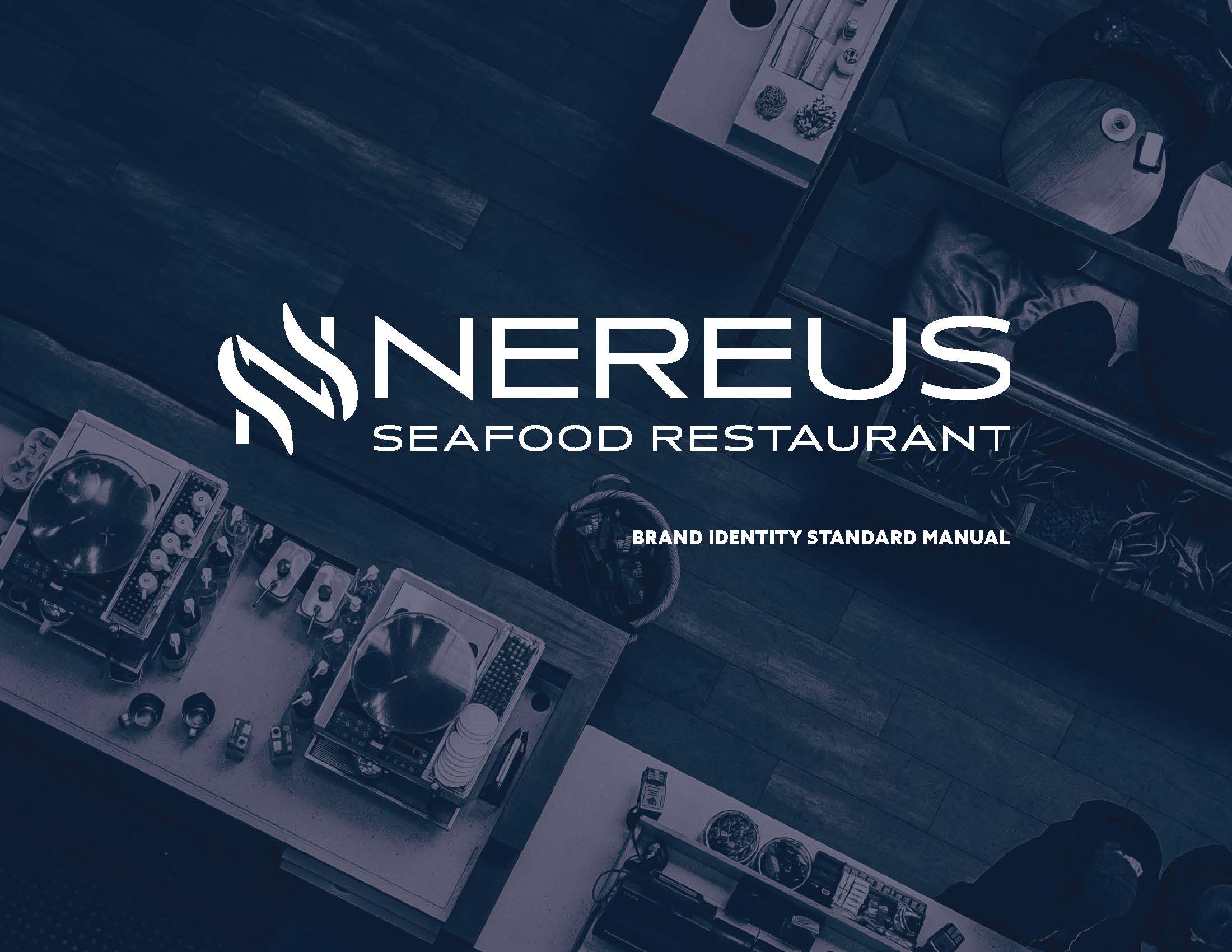
NEREUS Project
The purpose of this project was to create a brand identity standard manual for a new restaurant that includes menu, business card, and letterhead.
Nereus is a brand new restaurant with the intent on creating a place that utilizes the best of techniques, the freshest and best of ingredients, and creating a comfortable and sophisticated environment.
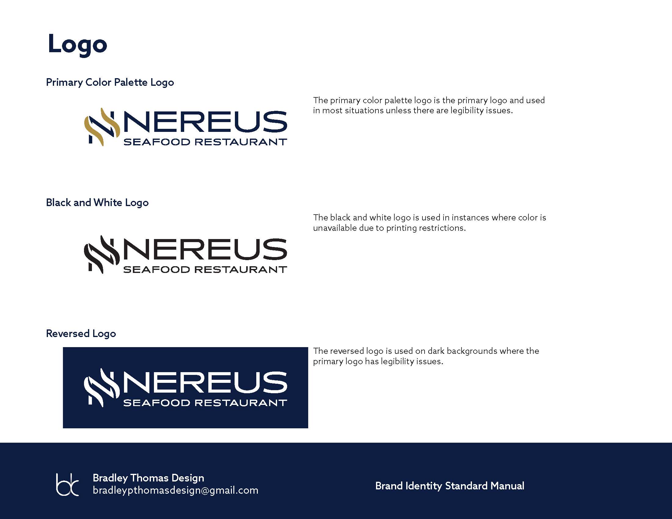
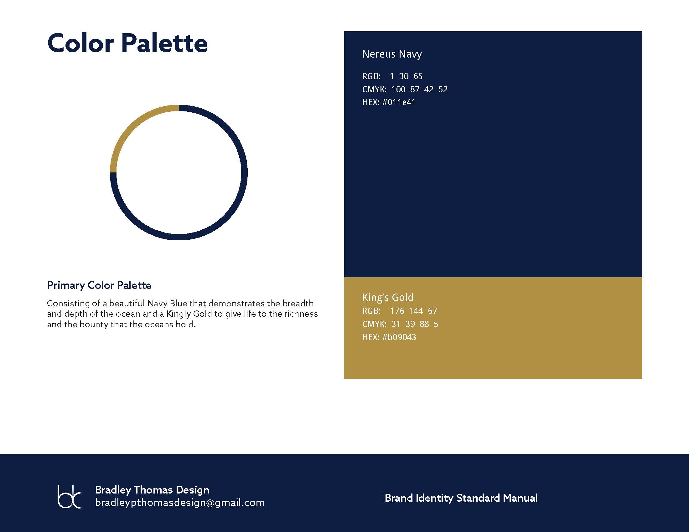
In order to best represent this desire while reflecting on the origins of the owner as well as the type of restaurant, the decision to go with a deep navy blue to represent the ocean and its depth and breadth and to accompany it with a kingly gold to represent the richness of the oceans bounty.
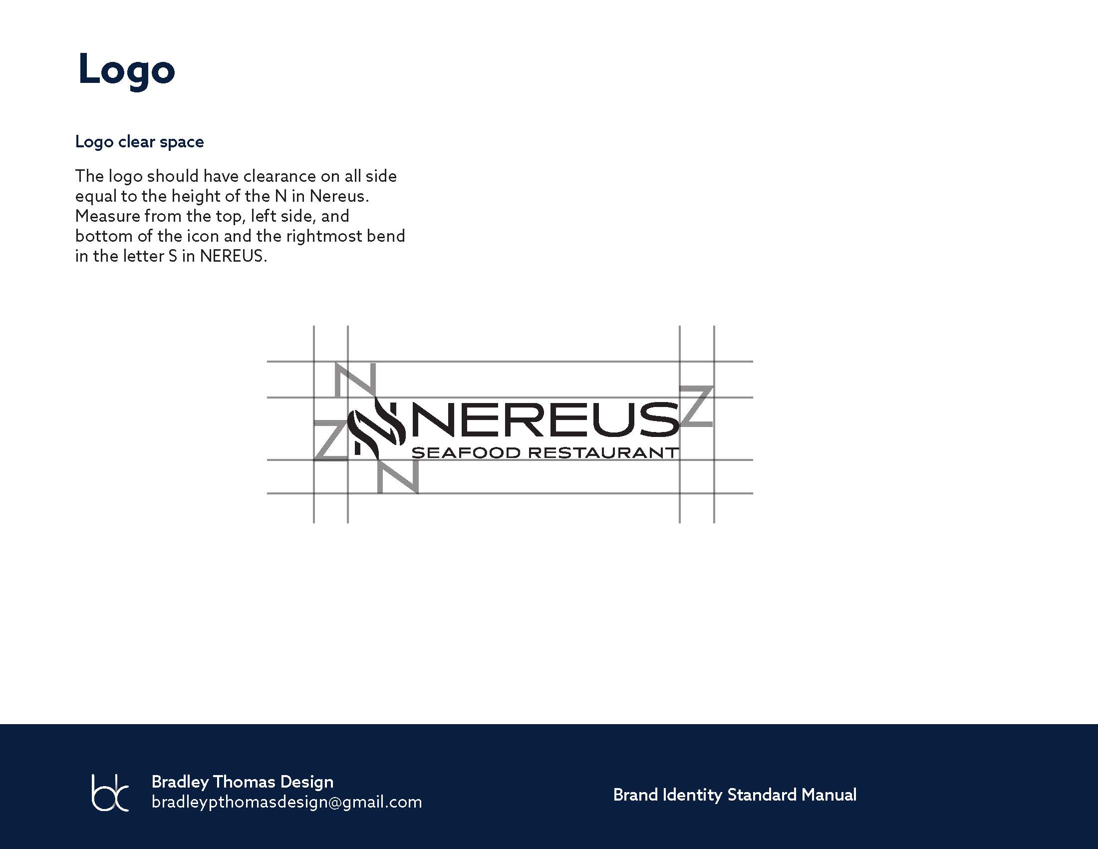
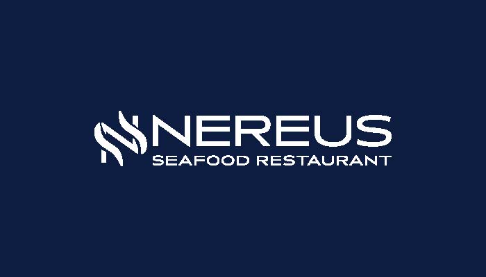
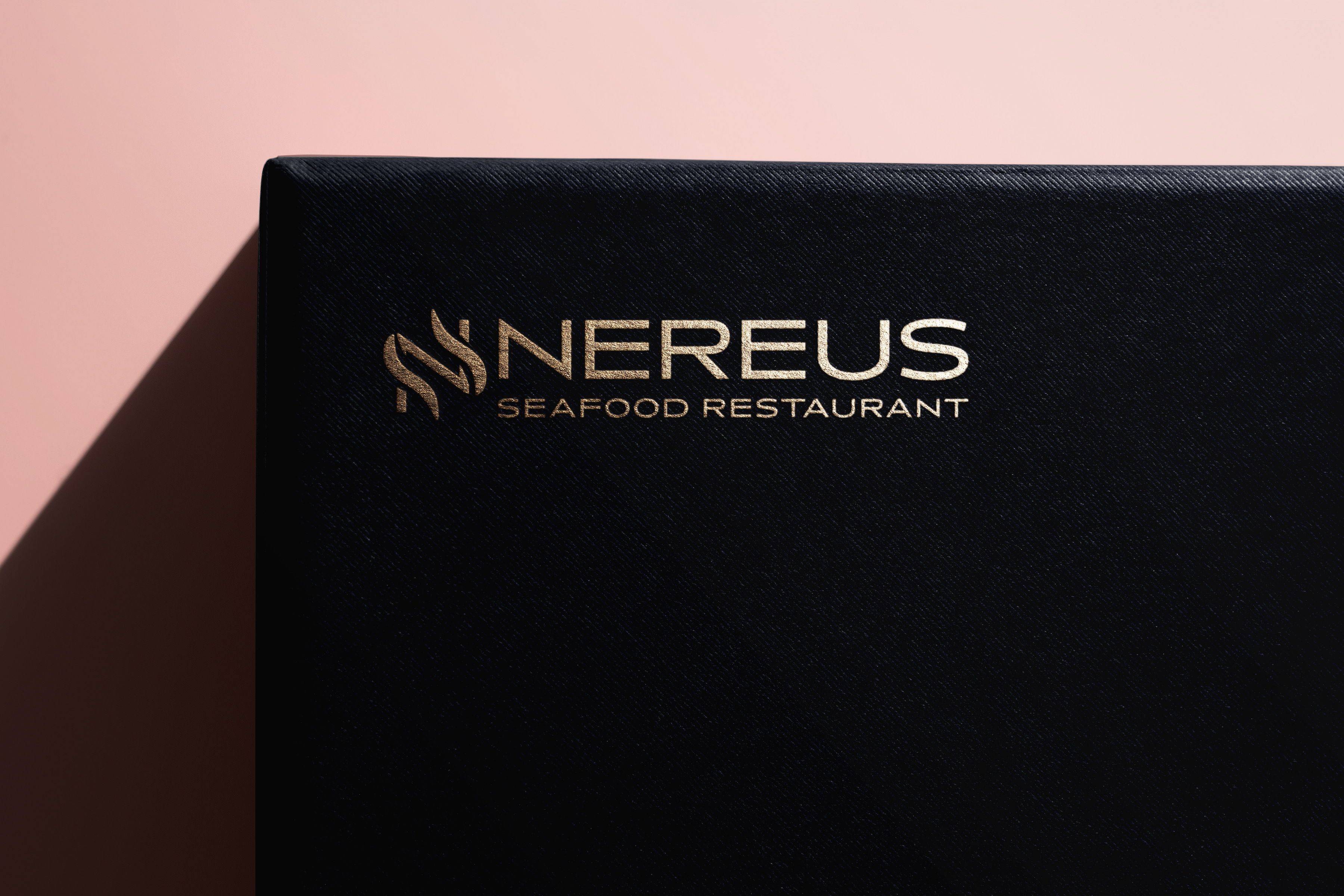
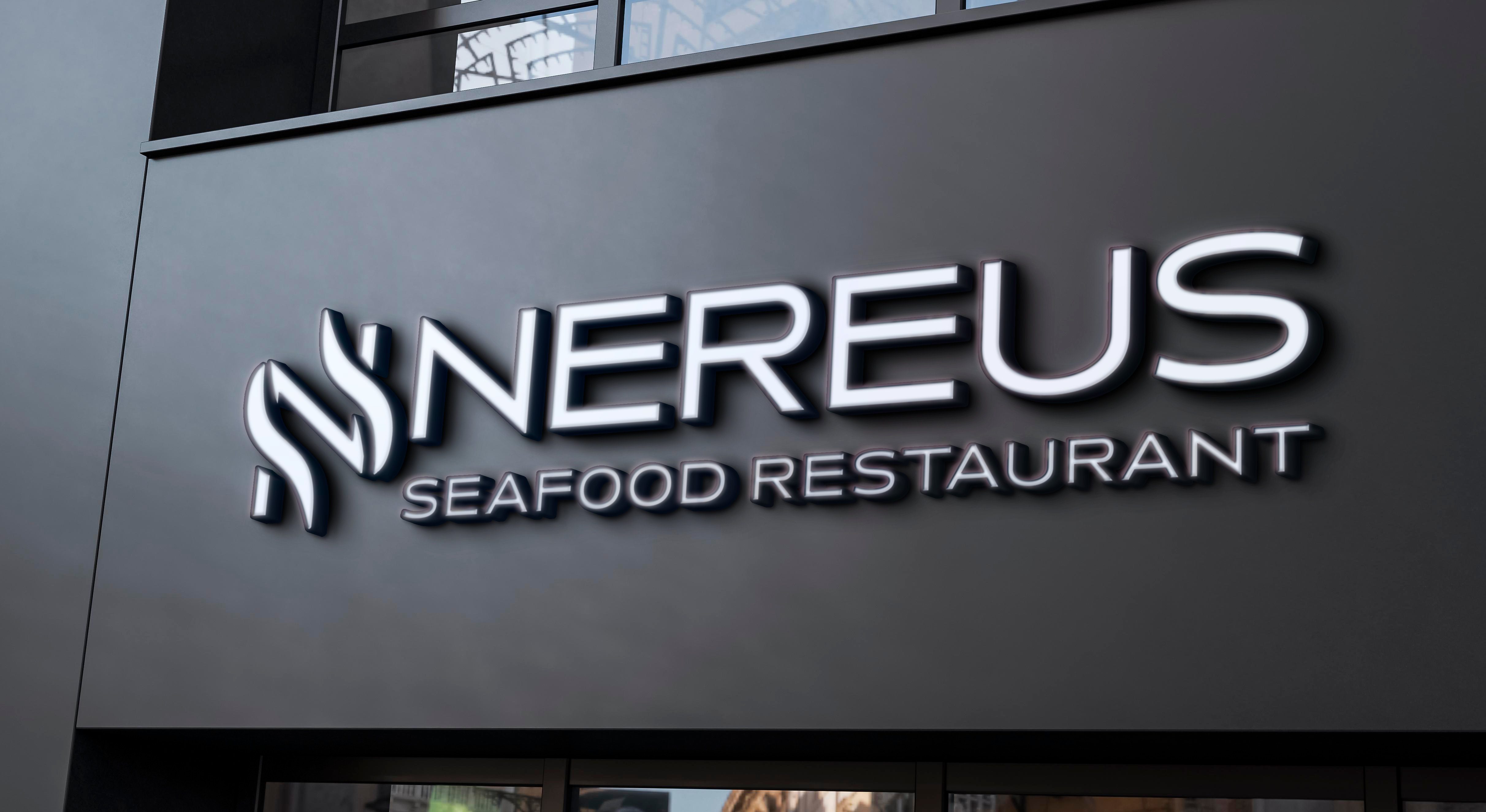
These two colors in hand, the logo was created to look elegant and sophisticated while giving a modern feel, so a minimalistic approach was taken. The resolution was the creation of a simple text block of the name of the restaurant, NEREUS, with a stylized N utilizing two wrapping golden spikes that resemble both a tendril, such as an octopus or squid, as well as representing the point of a trident or a harpoon two tool synonymous with ocean based hunting. This harkens back to the bounty and richness of the ocean while also maintaining a modern minimalistic elegance to the style to bring it in line with values of the restaurant.
With colors and logo decided the typography had to be settled. Azo Sans is a simple, geometric, and elegant typeface that checks all the boxes. It’s clean and minimalistic design allows for it to be incredibly legible and provides excellent readability in the smallest of type. It’s simple elegance matches perfectly with the intent of the restaurant and it’s values.
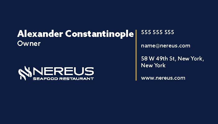
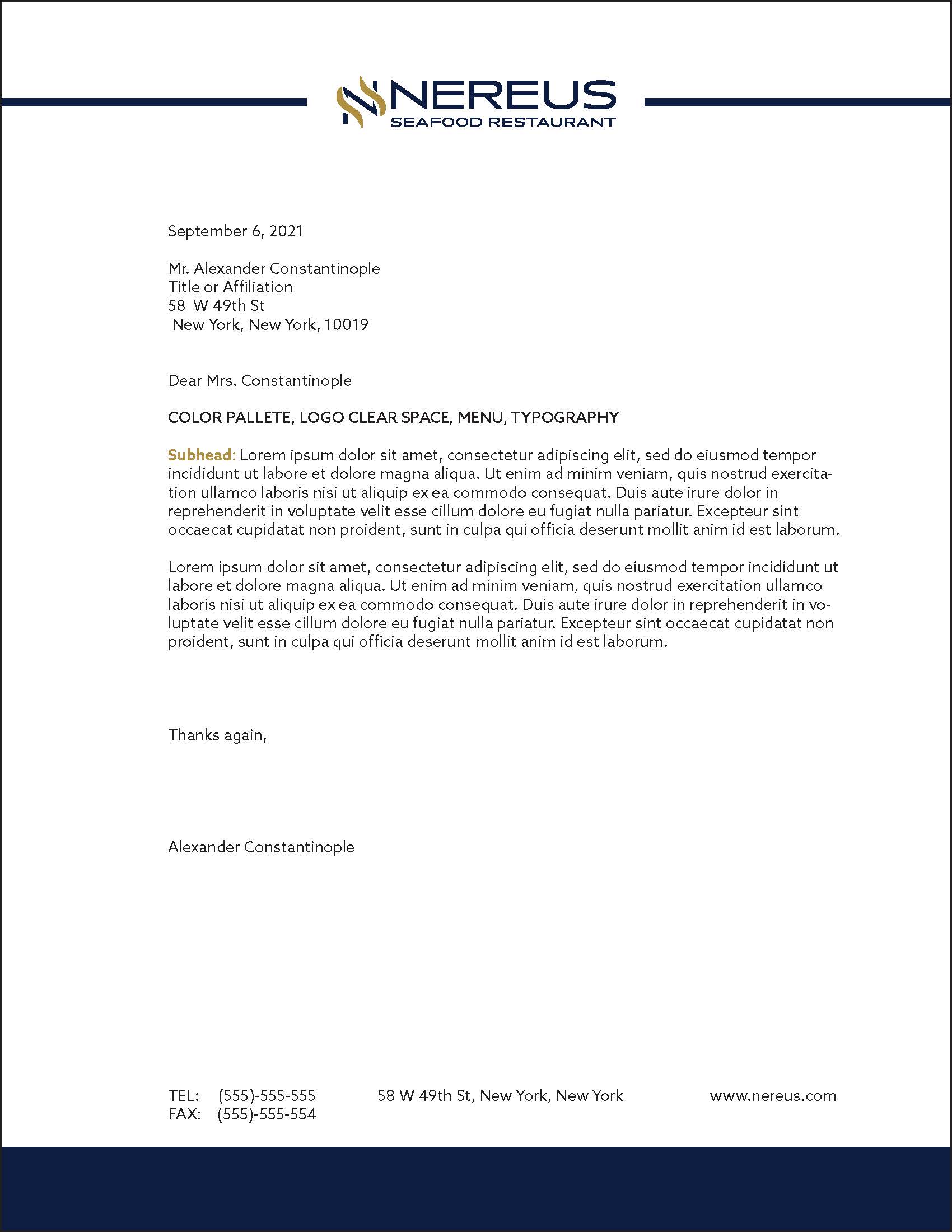
A simple business card would match the rest of the design for Nereus. A simple colored front using the deep navy with a reversed logo provide an easily readable and striking front that still gives a simple elegance. The back gives ample room for long names and has the information on the far right side of the card. The design focuses on the name first which has the title underneath but leads the reader to phone number, email, physical location, and website.
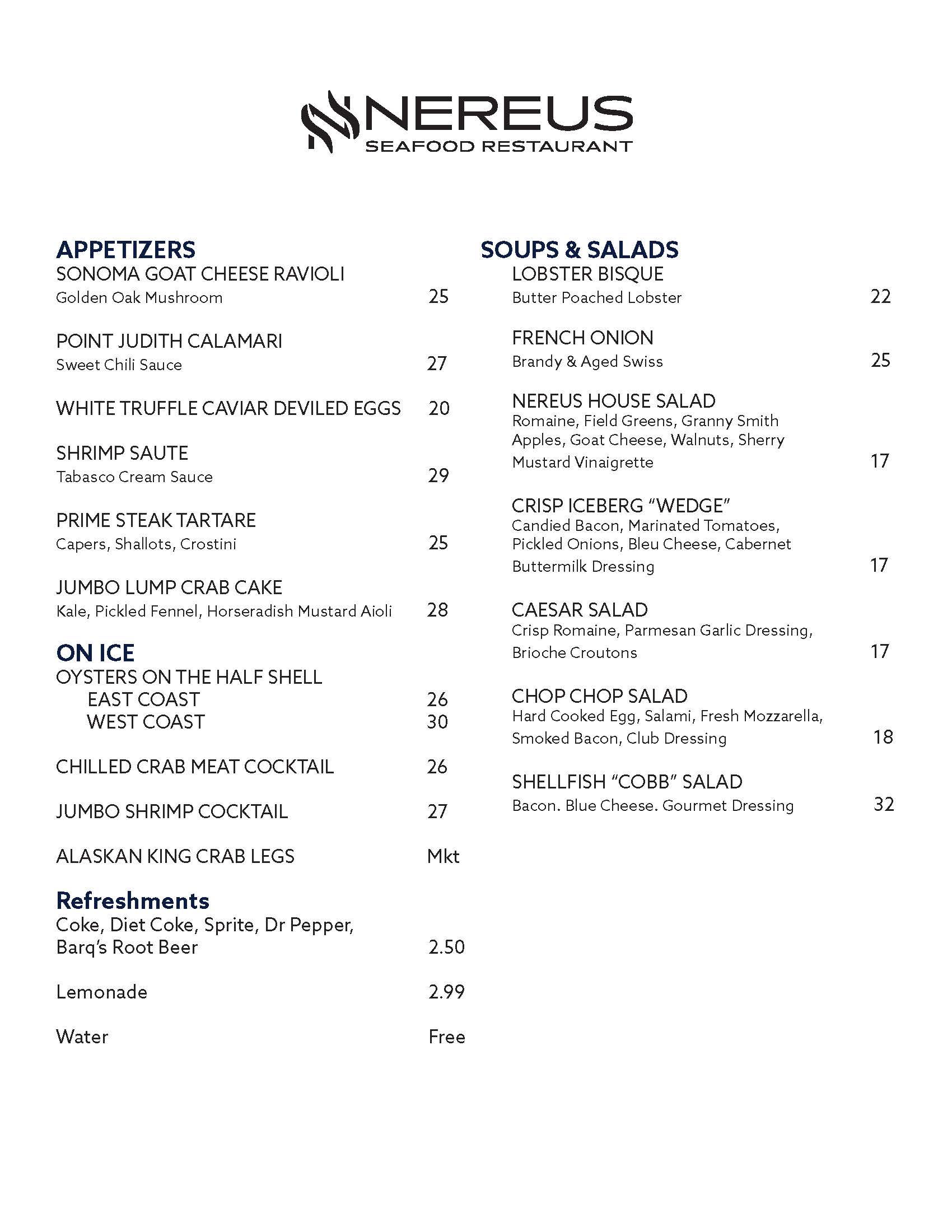
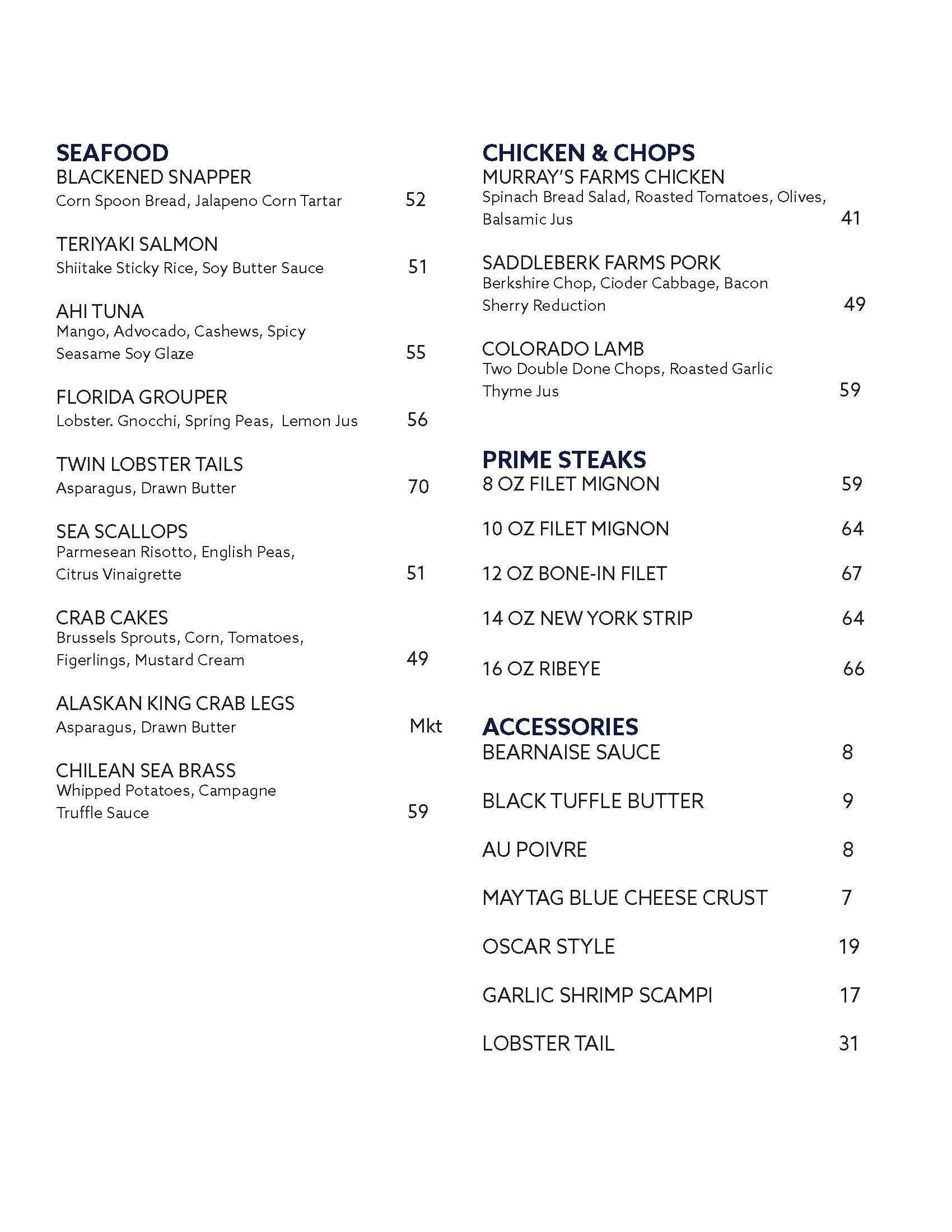
A minimalistic menu that doesn’t have unnecessary frills or ornamentation would best serve the intent of the restaurant. Focusing on the food with an easy to read menu for easy to access information fulfills the needs of NEREUS by helping create a comfortable environment for the reader.
Designed by Bradley P Thomas Design © All Rights Reserved 2023